A scoring tool based on healthcare usages

Getinsured is a Saas technology provider for public sector healthcare. Their technology platform offers solutions to state-based marketplaces and enables every American to access affordable healthcare.
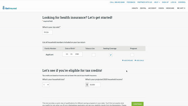
One of the solutions GetInsured offers is the Decision Support Tool (DST). The DST is an aid in finding a health plan that matches the consumer’s usage patterns and specific preferences for providers and prescription drugs. In collaboration with the Washington Health Benefit Exchange, we tested the usefulness of the DST to Washington consumers and subsequently proved its value to other state-based exchanges.
At Pure Energies, the sales pipeline was divided by two sub-teams: Solar Specialists and Solar Advisors. All the sales agents were using our internal tool and Salesforce to evaluate customers' solar needs, but we learned that the tools did not align with their assigned roles. Each of the tools' workflows were chaotic and the applications were unstable.
The goal was to redesign our internal tool to democratize the lead pipeline for everyone in the sales team. By achieving this goal, each sales agent can build his/her own book of business.
I spent a week shadowing our agents (new and seasoned), sat in on their sales calls, and observed their use of our CRM and Salesforce. The main takeaways based on my observations were:
After some deliberation with our stakeholders and the technology team, we decided to keep the overall layout as a constraint. I drew up a few iterations on how we can strengthen the context of the application.

In the final design, we focused on some key components that would be user friendly to all our agents:


We presented the final designs to our stakeholders, the agents, and they were pleased that we were able to incorporate earlier feedback into the new interface.
By embedding polygon drawing for all agents, the systems designer role was freed to work on higher level tasks. This also sped up the sales pipeline. We eliminated lead poaching by eliminating Salesforce and empowering newer agents to create their sales portfolio.
My director and I took inventory of our existing designs (implemented in YourHealthIdaho and Getinsured.com platforms) and performed our own internal usability tests. A few insights we gathered were:

In our internal testing, we also learned that consumers had different interpretations of the questions posed in the DST. For example when we ask the question, "On average, how often do you expect each number of your household to visit a doctor this year?", the consumers responses vary:

We took our findings and applied new copy that could be more relatable and minimize the cognitive load off of the consumer.
For Washington Health Planfinder's prototype, we played around with the answers regarding the hospital visit question. Instead of providing only numerical responses, we added supporting text to see if it would be appropriate and useful.
After having conducted usability tests on Washington consumers, we've found that the supporting text next to the number of visits was really helpful for them.
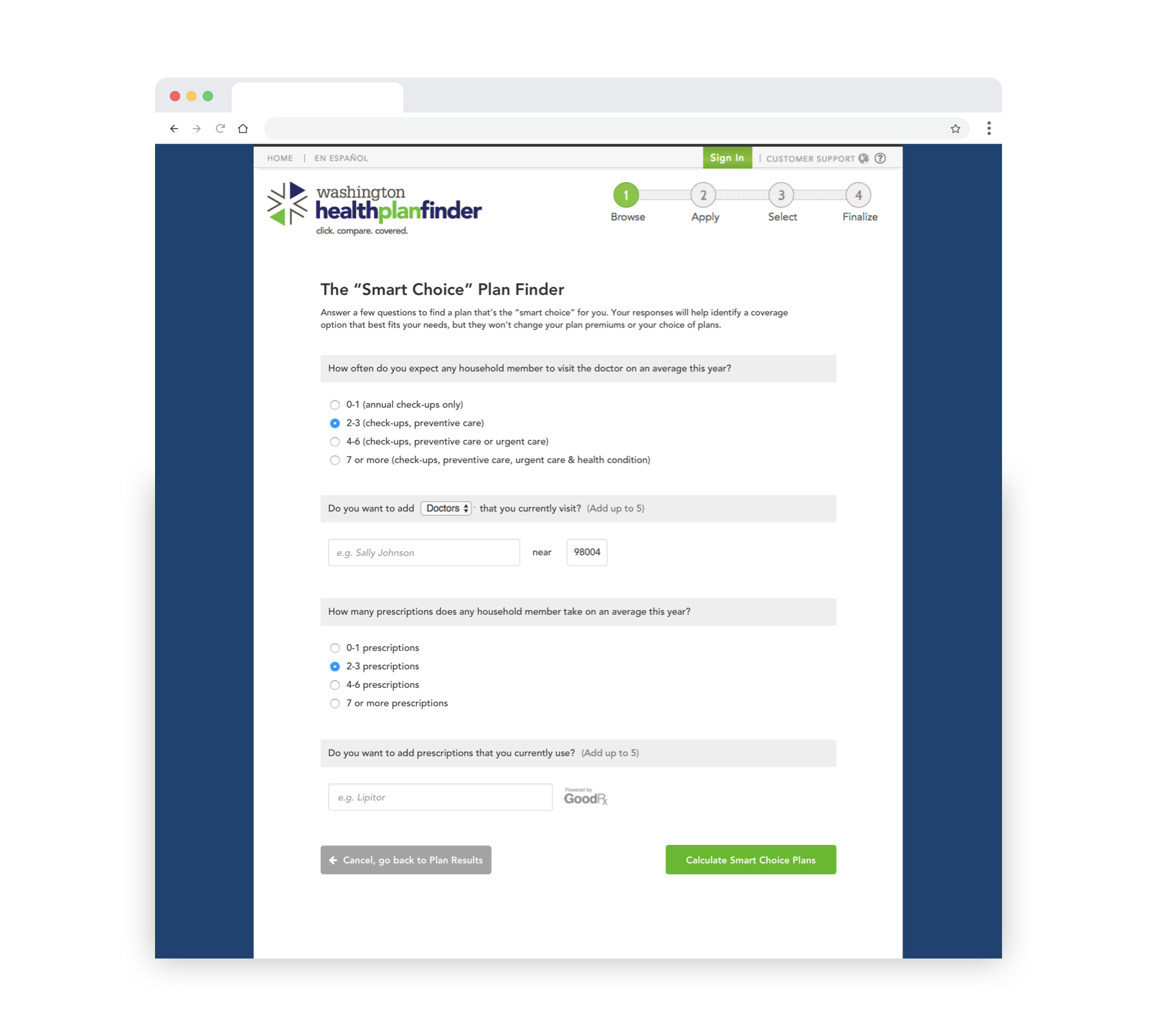
As Washington Health Planfinder was moving forward with our prototype, we took the support text concept and pushed our UI designs further. We expanded the support text into four relatable usage levels.


Washington Health Planfinder moved forward with implementing our DST with some changes to language. At Getinsured, we used our work on this project to sell to other State Based Marketplaces. The concept of usage levels were so well received amongst other states that they’re now implemented state-based marketplaces such as Covered California, MNSure, and Get Covered NJ.